 Flippd Help
What charts and visualizations are available in Reports?
Flippd provides several visual tools in the Reports section (and on the Home dashboard) to help you spot trends and understand your business at a glance.
Charts in Reports
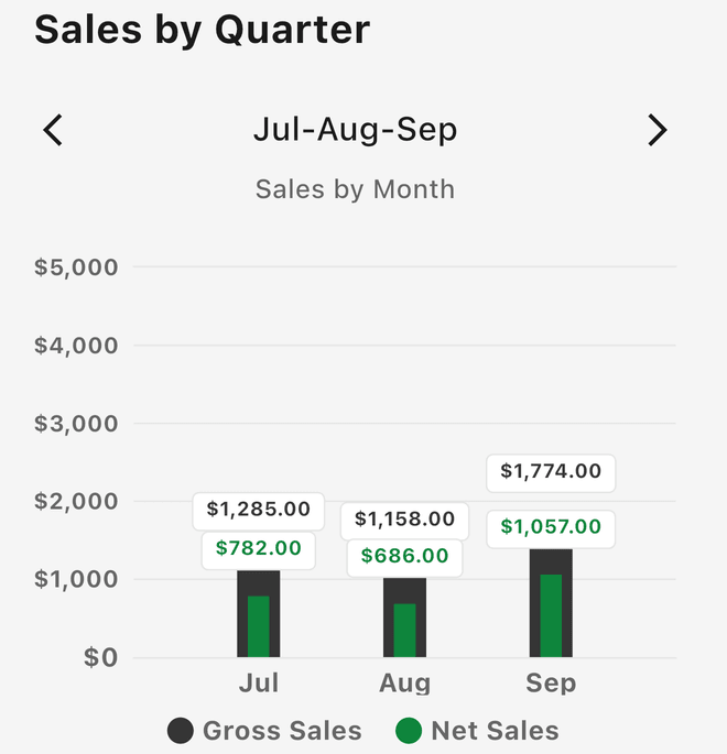
Sales by Quarter -- A bar chart of gross sales versus net sales for three months at a time. It opens on the current quarter; use the arrows to step to earlier or later quarters and spot seasonal patterns.
Platform Performance -- A pie chart of your selling platforms, sliced by Revenue, Profit, or Count. See which platform makes up the largest portion of your business.
Category Performance -- A horizontal bar list of your item categories, ranked by Revenue, Profit, ROI, or Count.
Source Performance -- The same bar list for where you bought your items, so you can see which sourcing spots pay off.
Year over Year -- A bar chart of gross sales versus net profit per year. It appears on the All Time report (choose All in the year picker) once you have at least two years of data.
Charts on the Home Dashboard
Sales Overview -- A 7-day, 30-day, or 90-day bar chart with your net profit, average ROI, best flip, and a comparison against the prior period.
Your Performance -- Your sell-through rate with a Low, Optimal, or High zone, plus a seller level that moves from Collecting to Selling to Pro.
Good to Know
- Tap a platform slice or a category or source bar to open those items in your Inventory
- Report data is cached for a few minutes -- pull down on the Reports screen to refresh after recording sales
- Use the Sales by Quarter chart during sourcing decisions to understand seasonal patterns